Brand Launch
Galena
Delivering a mystical brand experience to Gen Z women.
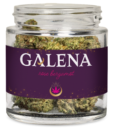
Cannabis brand, Galena, is inspired by ancient wisdom and the desire to infuse the essence of calm into our lives. In creating the name, identity and packaging for the line, our mission was to bring a touch of Galena’s tranquility into the modern world, inviting Gen Z shoppers on a journey towards the calmer, more centered life we know they crave.
Our challenge
Cannabis is big business and growing. Daily marijuana users now outnumber daily drinkers for the first time, according to a new report from researchers at Carnegie Mellon University. The preference change is largely being driven by young people – ages 18 to 24, 69% of whom prefer marijuana to alcohol, and Gen Z women in particular.
Creating a new cannabis brand name, visual identity, packaging structure and graphic design specifically targeted towards Gen Z women meant fully understanding what drives her – our sweet spot. The goal was to create an experience that resonates with Gen Z’s desired serene – yet vibrant – lifestyle, balancing soothing elements with creativity and uniqueness. The design approach needed to carefully balance a sense of calm, tranquility, and peace with bright, saturated colors that would stand out on social media and in dispensaries.
Our solution
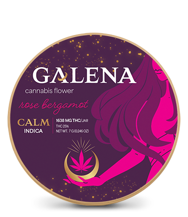
Originating from the ancient Greek language, the name Galena embodies the profound concept of calmness – a principle that has been revered throughout history for its power to foster tranquility, serenity, and an enduring sense of peace.
In the rich tapestry of Greek mythology, Galena was a symbol of calm personified. It represented an ideal state of being, where tranquility prevails over chaos, and serenity overcomes turmoil. This vision of peaceful existence was highly esteemed among the Greeks, who believed that a balanced and harmonious emotional state was not just desirable, but essential for a fulfilling life – the very essence of the product line.
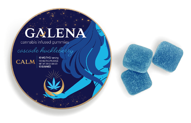
To develop a brand message and design that speaks directly to Gen Z women, we focused on themes of self-care, balance, and empowerment, conveying a warm and friendly tone to build a personal connection. The symbolism of the hand, holding a gold chalice, connotes a sense of support and nurturing female goddess energy. Beautiful, powerful, and serene.

A bold color palette provides a sense of stability and tranquility, while bright accents inject energy and positivity. Custom/hand-drawn illustrations, unique graphics and authenticity shown through human touch. The use of bold and experimental typography speaks to our female , Gen Z target audience who appreciates creativity and uniqueness.
Last, but certainly not least, we also chose sustainable packaging materials to align with the eco-conscious values of our targeted consumers.
Key insights
Marijuana sales among Gen Z women in particular have more than doubled since the COVID-19 pandemic lockdown in 2020, according to Headset, a cannabis analytics firm.
More than just a label; the Galena brand visual identity is both a testament to the core values/essence of the brand as well as a compelling visual design aesthetic that resonates deeply with Gen Z female consumers, delivering on her need for a life balance of tranquility, creativity and vibrancy.