Brand refresh
Ajax®
Softening up a tough guy
Iconic laundry detergent, AJAX, represents strength, toughness and lots of elbow grease. To appeal to thrifty millennial families, this hardworking blue-collar brand needed to soften its image and reveal its inner truth – as an approachable and sensible American brand delivering on it’s promise of a reliable, uplifting, laundry experience…at a great price.
Our challenge
Evolve an iconic American laundry brand by infusing approachable energy and positive emotion to appeal to a value-seeking generation with updated positioning, Master Brand visual identity evolution, portfolio naming strategy, scent naming and packaging graphics update.
Our solution
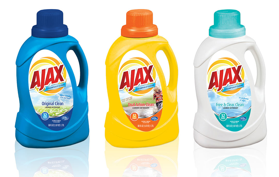
Building on AJAX’s red and blue core equities, utilize softer more approachable graphic elements that create an upbeat experience and purposefully lead the eye to the payoff….colorfully clean.
Distinctly delineating packaging SKU’s with color and natural graphic cues signal the unique benefits of each product and helps facilitate an easy shopping experience.
True to its heritage, this reliable brand is still as hard-working as ever and now also delivers a satisfying dose of feel-good freshness.
Master Brand platform and mark evolution
Master Brand logo evolution recaptures the brand’s all-American roots as a laundry detergent that works as promised and evokes a fresh, new sunshine-y clean feeling.
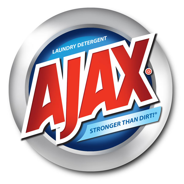
Before
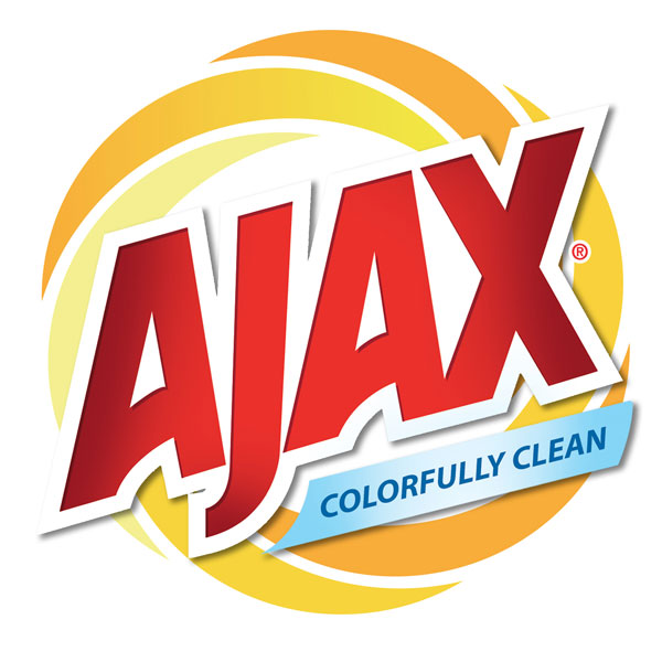
After
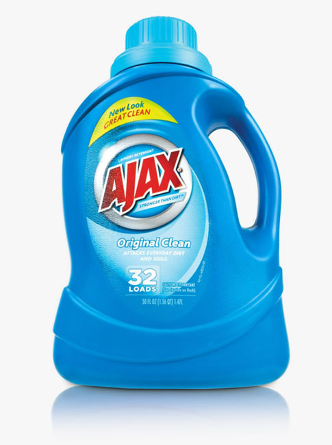
Before
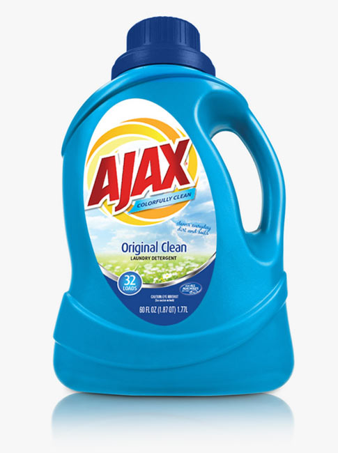
After
Key insights
Women remain the primary purchase decision-makers in the household. 51% of young female consumers shopping for their families now prioritize value first and are seeking brands they trust to get the job done.
The new AJAX delivers the perfect duo of an authentic American brand with an uplifting packaging vibe that quickly satisfies her desire for an effective laundry experience at a great price.
