Expert advice on future proofing your brand
This is the fifth post in our Rebranding blog series.
A category leader is facing stiff competition from new upstart and PVL brands and needs to protect and expand their brand.
What to do? Evolve a trusted brand into something new again.
To begin, there are some key questions to explore:
- Is your brand positioning and story still culturally relevant? And is that reflected in everything you are doing including your packaging?
- Are there any new driving insights that have emerged?
To evolve your brand and maintain category leadership, positioning and packaging need to clearly reflect your ideal customer values. Research shows loyal consumers can become tremendous brand advocates…and there’s nothing more powerful than a brand that demonstrates that it’s listening to it’s customers.
Take Freshlook colored contact lens brand from Alcon – a global leader in eye care. Known for comfortable and trustworthy contact lens technology grounded in science, the colored contact lens business was under significant competitive pressure, particularly in China.
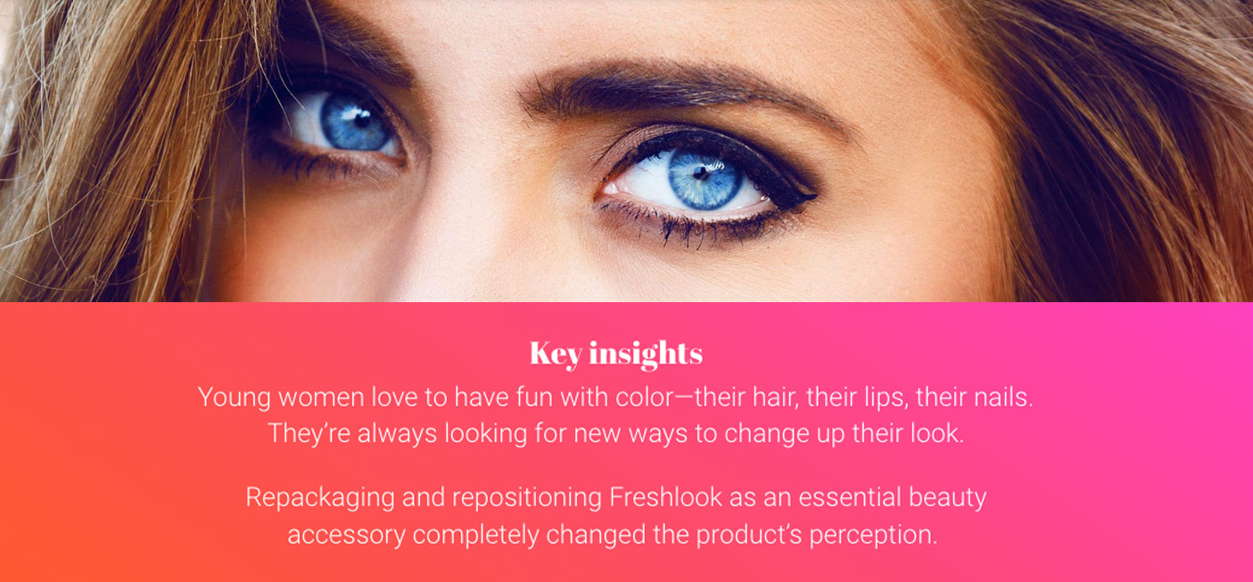
A deep dive into the target audience revealed a driving insight – female consumers in China want to feel empowered by all the products they buy – especially those they use or put on their bodies.
The Rebranding Challenge
For Freshlook, the challenge was to combat competitive encroachment and evolve a brand from ”just” a great contact lens – to something more: a premium beauty product that makes women feel empowered. To deliver on this need, Freshlook created a lens that actually transforms the color of a woman’s eyes, so she could express her own personal style and enhance her look.
Freshen Up Brand Appeal
To appeal to US and Asian Millennials and Gen Z consumers, the brand narrative and packaging needed a facelift. The shift evolved Freshlook from trusted contact lens brand to a true beauty brand, generating greater freedom of authentic, self-expression for consumers.
Utilizing insights in how “beauty” is expressed and perceived, coupled with close partnerships with internal global graphics team and brand leadership, domo domo created an updated Master Brand visual identity, packaging design system and sub brand naming system. Our work elevated the brand into something new again…a beauty essential that empowers women to create a complete look from head to toe, including their eye color.
Refresh Your Brand, We Can Help
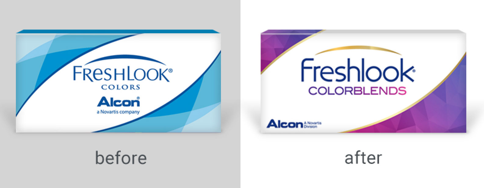
The updated Master Brand logo and package design system repositions the brand as a contemporary, premium beauty brand.
Use of contemporary font treatment, vibrant and modern color palette and package architecture – evolved this trusted brand into something other than purely functional…but, rather, desired.
Updated Segmentation and Package Design System
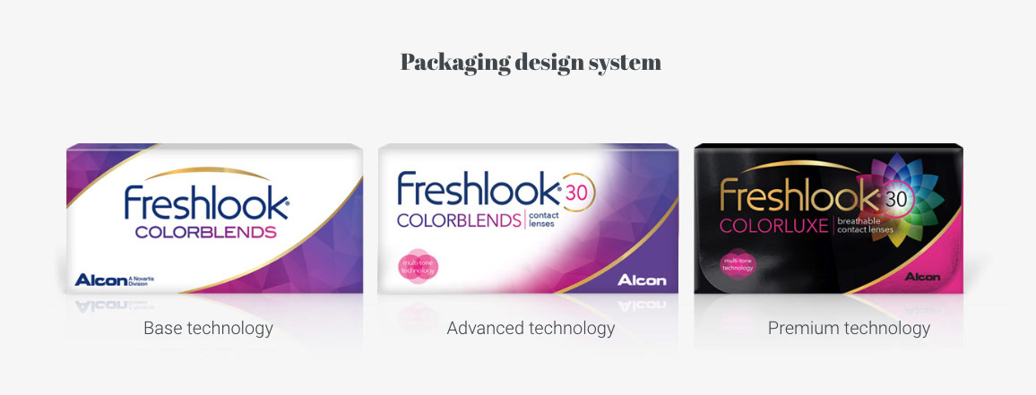
A brand refresh is a specialized design discipline, honed over years of experience coupled with an approach grounded in the science of marketing and the art of creative design. In the right hands, this process is an effective, and fast strategy to evolve your brand and maintain category leadership.
Explore the domo domo Rebranding Series:
Thanks for reading the fifth installment in our monthly series on rebranding, where we share insights, ideas, and inspiration to help inform your next brand and packaging refresh. Ready to learn more? See the full rebranding series.
At domo domo marketing we are brand and packaging refresh experts. It’s our thing. For other examples: Check out our work.