Where Should Your Rebrand Begin? With an Archeological Dig.
This is the second post in our Rebranding blog series.
We’ve heard the challenge many times. – an established brand needs a refresh but may not know where to start.
It can feel like a daunting project. Our experience has shown that an efficient and effective approach is needed to achieve the goal of keeping current consumers, attracting new ones, and returning to relevancy and sales.
We always begin with what we call the “Archeological Dig.”
What does our “archeological dig” phase of a rebranding project include?
In this phase we are focused on excavating and sifting through all the current brand assets (the dig site) to identify brand equities (the artifacts) and record them for further study – all with the goal of collecting data to inform future design decisions about what to carry forward and what to discard.
Artifacts recovered from the dig include the current visual design system and brand experience, Master Brand mark, color palettes, fonts, iconography, package design, structure, materials, current consumer experience with the package, print production and manufacturing considerations.
In any archeological dig – the context (relationships among the other types of data) is the last, and most important part of the process. To benchmark the rebranding process, a comprehensive category and competitive analysis is required – consumer insights, architecture, segmentation and navigation at shelf, and competitor visual identity and assets.
Putting the “archeological dig” in the context of a rebranding project.
Taking a step back from the product itself, the full context of a rebranding project requires understanding the bigger picture. Take, for example, our work with Systane.
Products in the wellness space face a particular challenge: claims, features and benefits, and regulatory copy all need to fit and work on small packages. The shopping experience can be very messy and complicated!
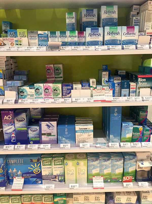
Systane needed their rebrand to take this need into account, while communicating to the consumer, at-a-glance, how their product provides superior dry eye relief.
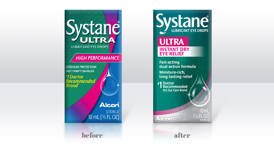
A brand refresh is a specialized design discipline, honed over years of experience in the field requiring a disciplined approach grounded in science coupled with an informed creative “eye” garnered from years of “digging” to recognize nuances in design elements. In the right hands, this process is an effective (and fast strategy) to get your brand back on the road to relevance.
Explore the Rebrand Series:
Welcome to the second installment in our monthly series on rebranding, where we will share insights, ideas, and inspiration to help inform your next brand refresh. At domo domo marketing we are rebranding experts—it’s our thing. For other examples: Check out our work.