A Rebranding Evolution or Revolution?
This is the third post in our Rebranding blog series.
We’ve heard the challenge many times before – the shelf has become a much more crowded, confusing and competitive place – What to do?
A packaging update.
Brands are like sharks – they need to keep swimming to stay alive – there is a constant need to keep evolving to stay relevant. And if you’re not thinking of refreshing your packaging now, you’re already on the road to obscurity.
Now that the archeological dig phase of your rebrand project is complete, your objective is set, consumer insights and need(s) identified, brand assets sorted and categorized what to keep, what to toss, and what to evolve – you’re ready to start the packaging update.
Rebranding: Evolution vs. Revolution
The challenge – how far can you take your design to inject a fresh new look while not alienating current consumers?
At domo we call this evolution vs revolution.
A packaging evolution creates a new, modern look while paying homage to existing equities of the brand’s origins. A gradual shift in graphics breathes new life and relevancy into the brand with minimal potential of alienating current consumers.
A revolution – is a seismic shift that many times includes a full reset of your brand design. It’s more radical change usually required based upon a variety of circumstances and marketplace challenges that includes rehabilitating and rejuvenating a struggling brand. The potential to alienate current consumers exists and needs to be considered within the larger context of brand challenges. We aim to help your brand evolve, without creating revolution.
Take Wet Ones – a category leader brand that consumers trust – needed packaging that more clearly communicated the experience of using the product – a fresh feeling, scent-driven experience.
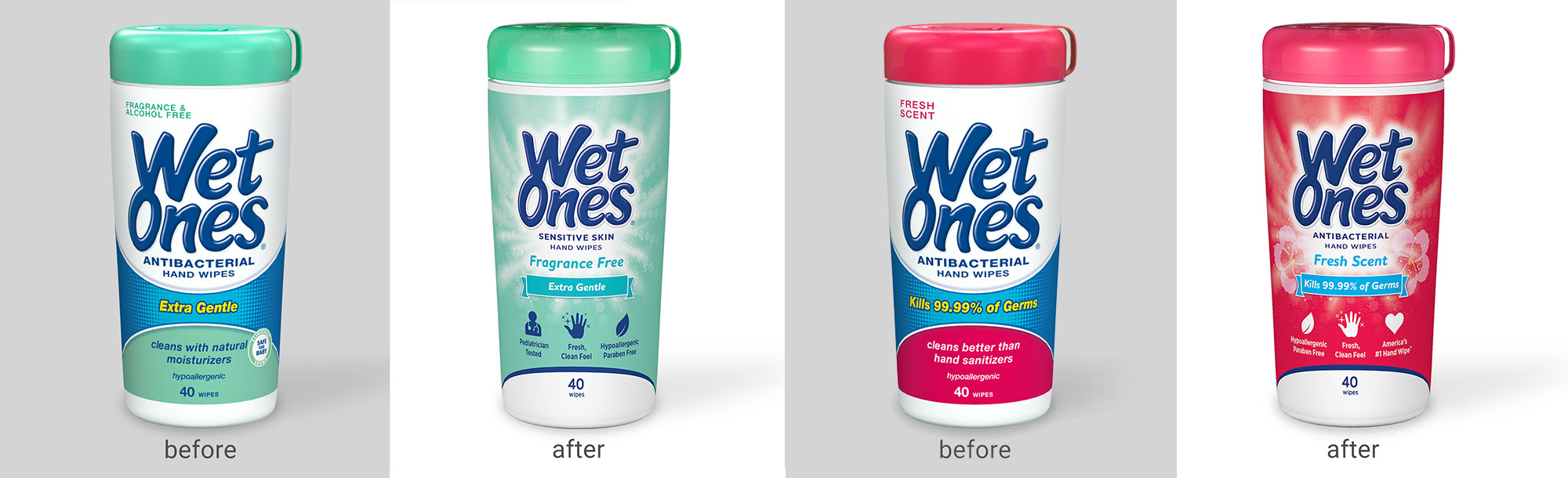
As America’s #1 favorite hand wipe trusted and beloved by consumers – the packaging refresh called for a fresh new look grounded in the existing brand equities. An evolution. This is the power of brand redesign – to evolve the look and feel of a package to more closely associate with desired brand attributes.
A brand refresh is a specialized design discipline, honed over years of experience and grounded in the science of marketing and the art of creative design. In the right hands, this process is an effective, and efficient strategy, to evolve your brand and get back on the road to relevancy.
Evolve Your Brand Without Losing Customers
As you enter the evolution vs. revolution phase of your rebranding process, it will be important to remember why you started the rebrand project in the first place.
To prepare customers for the new appearance of your brand or product, remaining transparent and publicizing your rebrand will be important. Consider how this evolution can be shared across your marketing channels and share your motivations with your consumers to encourage their enthusiasm about the revamped look and feel.
Explore the domo domo marketing Rebranding Series:
Welcome to the third installment in our monthly series on the art and science of the brand and packaging refreshes – where we will share insights, ideas, and inspiration to help inspire your next rebrand.
At domo domo marketing we are brand and packaging refresh experts. It’s our thing. For other examples: Check out our work.